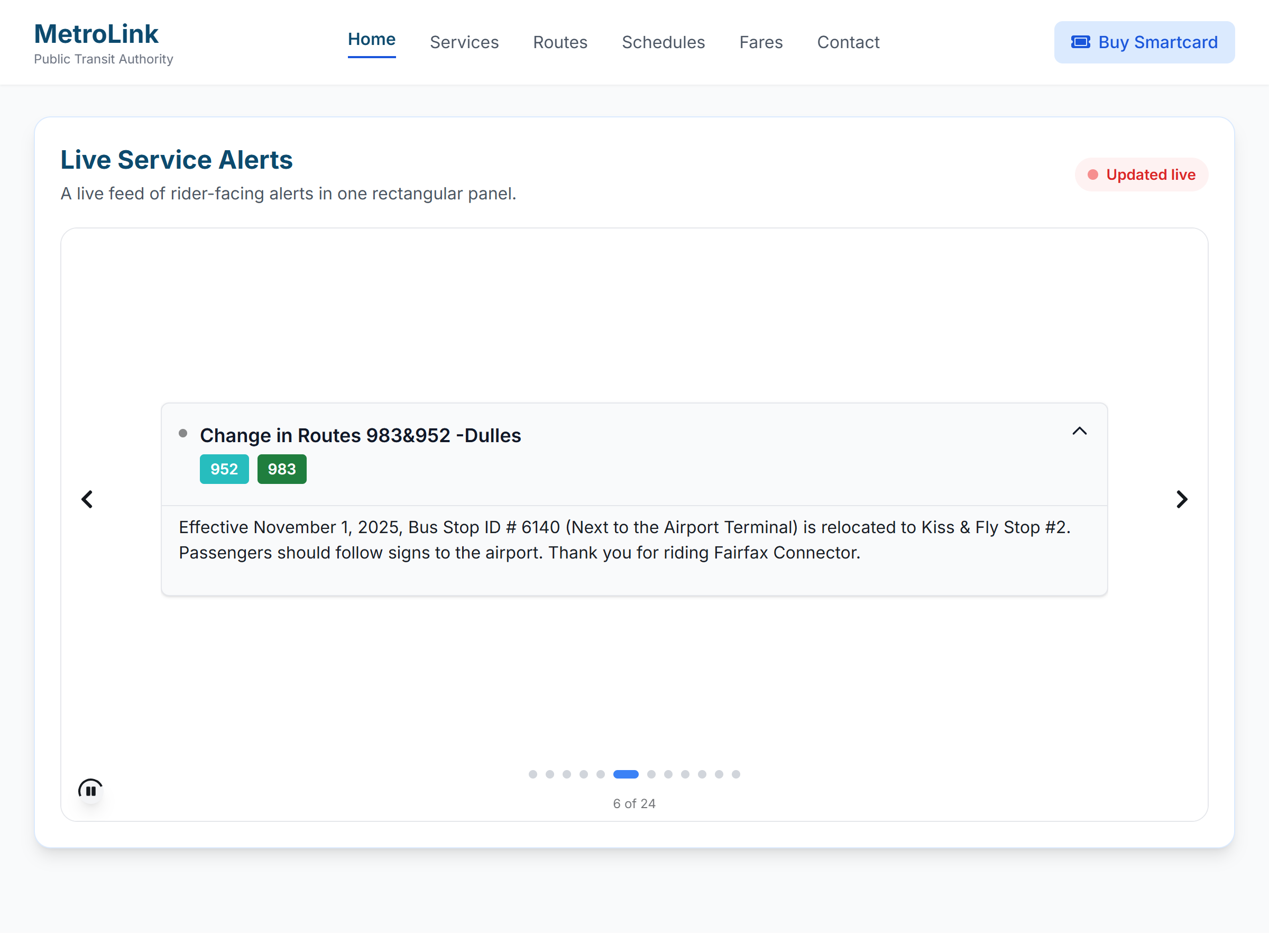
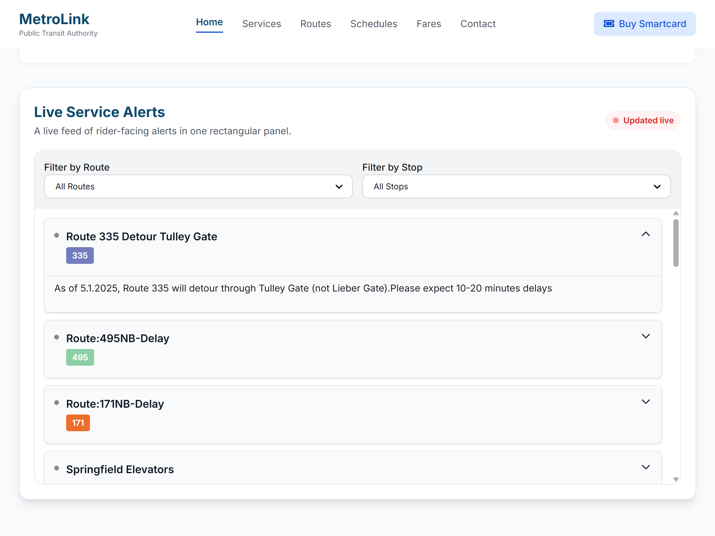
Alerts Widget

Service alerts riders can understand at a glance

Publish high-visibility transit alerts with clear severity styling, route context, and layouts that match the way your agency communicates on the public web.

Mockup of a transit alerts interface with clearly visible service alerts and clean hierarchy

Presentation Modes

One data source, multiple public-facing alert formats

The `TransitWidgetUI` app already supports ticker, categorized, carousel, and sophisticated alert layouts. This page packages those ideas into a clear agency-facing story.

Ticker

Best for a homepage header or system-wide notice strip where riders need a short update immediately.

Carousel

Rotates through active alerts in a compact, high-visibility format that works well for homepage feature areas and announcement sections.

Categorized

Group alerts by route, stop, or type so riders can scan only the disruptions that matter to their trip.

Sophisticated

Use a richer layout with filtering, stronger visual hierarchy, and more room for guidance and next steps.

Public Clarity

Built for real rider questions, not just internal terminology

Good alerts explain what changed, who is affected, and what to do next. The widget is designed to surface that information cleanly across desktop and mobile layouts.

  • Severity styling helps agencies distinguish informational notices from high-impact disruptions.
  • Route and stop context reduces the chance that riders misread a system-wide alert as relevant to every line.
  • Layout flexibility supports homepage banners, service pages, and route detail pages without rebuilding content.
  • Agency teams can keep communication consistent with brand colors and public messaging standards.
Rider-first

Actionable wording

Pair the disruption with a workaround, temporary stop, or expected duration.

Responsive

Compact to expanded

Use narrow ticker styles on smaller pages or switch to card layouts where more context fits.

Operational

Live feed driven

Designed to work with GTFS real-time alert feeds instead of a manual website editing cycle.

Branded

Looks native

The widget can feel like an intentional part of your site rather than an embedded afterthought.

Example Placements

See the alert layouts in context

Four examples showing how different alert presentations can work across public rider experiences.

Screenshot of a sophisticated transit alerts layout with richer hierarchy
Sophisticated

A richer alert experience gives riders more context and clearer next steps

This is the most complete alert presentation. It gives agencies room for stronger hierarchy, filtering, explanation, and rider guidance when situations are more complex.

  • Best when alerts need context, severity cues, and follow-up guidance.
  • Supports a more premium public-facing service alerts experience.
  • Gives agencies a flexible format for more complex service changes.
Ticker

A single high-priority message that riders notice immediately

This format works best when one alert matters more than everything else on the page. It keeps the message short, visible, and hard to miss.

  • Best for homepage banners and system-wide notices.
  • Keeps attention on the most urgent update.
  • Gives agencies a clean way to surface major disruptions fast.
Screenshot of a ticker-style transit alert layout
Screenshot of a categorized transit alerts layout
Categorized

Riders can scan the alerts that matter to their trip instead of reading everything

Categorized layouts group alerts by route, stop, or alert type so the information feels organized and easier to act on.

  • Helps riders self-sort what is relevant and what is not.
  • Works well with frequent route-specific messaging.
  • Creates a cleaner experience than one long undifferentiated list.
Carousel

Multiple active alerts can rotate through one compact display area

Carousel layouts are helpful when several alerts are active at once but screen space is limited. Riders still see each message without the page feeling overcrowded.

  • Useful for feature areas and public information pages.
  • Surfaces more than one alert without overwhelming the layout.
  • Keeps the experience visually tidy while still visible.
Screenshot of a carousel-style transit alerts layout

Want a cleaner service-alert experience?

We can map the widget to your routes, communication style, and public website structure.

This site is protected by reCAPTCHA and the Google Privacy Policy and Terms of Service apply.